
Color Schemer has been launched
on your Mac App Store
×
Subscribe for UpdatesWeekly Color Scheme Digest
Every Monday, get all the new schemes postedduring the previous week sent to your inbox.
New Course Content Announcements
Whenever a new section is added it to our course, you can be the first to know.
Company and Product Updates
Whenever something big happens, or new features launch, you can be the first to know.One-Time Alert: Windows Launch
As soon as the Windows version is ready, we'llsend you a one time email to get you started.
We respect your inbox as much as we respect a well-crafted color scheme. Your email is safe with us ‐ no third-party nonsense, no spam. Easily unsubscribe with one click, no hard feelings.
Color Schemer
Introduction to Color Theory
A brief history of color theory:
the color wheel and harmony
the color wheel and harmony
Techniques for creating
harmonious color combinations
harmonious color combinations
Is RYB and the color wheel
wrong and outdated?
wrong and outdated?
Color Models and Systems
Comparing RGB, HSL, HEX and CMYK,
and where they fall short for design
and where they fall short for design
Color management and calibration
across different monitors and devices
across different monitors and devices
Introduction to modern
color systems and models
color systems and models
Advanced Color Theory
Go Beyond the Color Wheel:
CIELAB and Advanced Color Models
CIELAB and Advanced Color Models
Coming Soon
Monochromatic Color Schemes:
Tips, Examples, and Applications
Tips, Examples, and Applications
Coming Soon
Applying Perceptual Color Spaces in Design: Techniques and Tools
Coming Soon
Making Colors "Pop" with Chevreul’s
Law of Simultaneous Contrast
Law of Simultaneous Contrast
Coming Soon
How to mix colors and
create beautiful gradients
create beautiful gradients
Coming Soon
Contrast and Accessibility
Utilizing WCAG to improve text readability and contrast
Coming Soon
Creating accessible designs for people with color vision deficiencies
Coming Soon
How popular is Dark Mode, and
is it actually useful?
is it actually useful?
Coming Soon
Color for Brand, Web and UI Design
Creating effective color palettes
for UI/UX design
for UI/UX design
Coming Soon
Color in typography and text hierarchy
Coming Soon
Color Theory for Data Visualization Design
Coming Soon
Biology, Psychology and Emotion
The impact of color on user
experience and behavior
experience and behavior
Coming Soon
Understanding color trends
and how they affect design
and how they affect design
Coming Soon
How biology and evolution
influence our perception of color
influence our perception of color
Coming Soon
Meanings of Color
Across Different Cultures
Across Different Cultures
Coming Soon
Debates and Opinions
Why perfect color matching
just isn't possible
just isn't possible
Coming Soon
Are black and white colors, and
should they be used in design?
should they be used in design?
Coming Soon

Color management and calibration: A pragmatic introduction
Every monitor is unique — here's how to ensure your designs look good across all of them
You might have noticed how TVs in an electronics store play the same video, but it looks different on each panel. This is due to varied hardware and color management, a concept vital for every designer to understand.
How Digital Displays Work
Each pixel on your monitor combines three primary colors: red, green, and blue (RGB). By varying the intensity of these colors, pixels can generate millions of distinct colors. When all three colors are at their maximum intensity, they produce white. Modern monitors boast about 300 pixels per inch (PPI) or more, creating images that appear seamlessly blended from a normal viewing distance.
Since every monitor technology has slight differences, uncalibrated displays can lead to color distortions. Thus, calibration is crucial to ensure the colors you design display accurately on any screen. Proper calibration aligns your monitor’s color output with a recognized standard, making sure your colors look as intended.
sRGB vs. Display P3
sRGB, short for Standard RGB, is recognized by nearly all monitors, and covers about 35% of the visible color spectrum. It's your go-to for broad compatibility, as nearly all monitors align to this standard.
Display P3, a newer standard, is popular in digital cinema and encompasses roughly 50% of the visible spectrum. It makes photo and videos look better, a key reason for its growing adoption. However, it requires a more expensive display technology.
This image from Apple WebKit blog post demonstrates the difference between these color spaces perfectly:
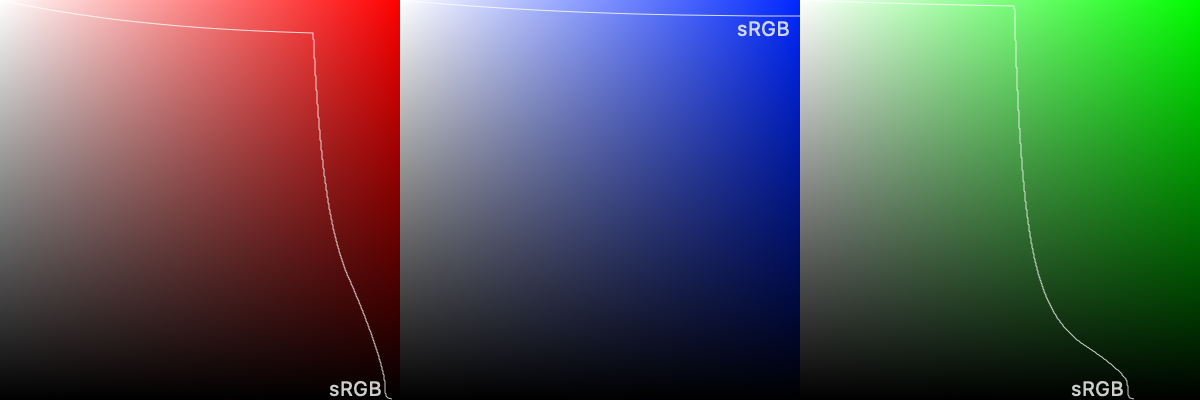
Apple pushed Display P3 into the computing mainsteam, likely due to their strong focus on digital content and camera functionality. All modern Apple devices and increasingly more high-end Android devices and PC monitors run on Display P3.
For digital design, it's safer to stick with sRGB. It continues to be the backbone for most digital content. It scales well to Display P3 without losing vibrancy, whereas scaling in reverse can result in muted colors.
Calibration: Aligning to Standards
Every monitor varies, based on the panel technology, backlight, finish, and even environment. As a result, your colors will look different on every monitor, and calibration is required to standardize the colors between them.
A color chart can be used to compare the monitor output to the standard color, and the monitor can then be tuned for the best balance.
From WikiCommons
For the highest level of accuracy, you would need a colorimeter like i1Display Pro or Spyder series to inform your monitor on how every color should be displayed. As the panel ages, re-calibration becomes be necessary.
Have an Apple device? Good news — Apple does the groundwork to ensure the display is true to color right out of the box. If you've every wondered why some monitors are "specially designed" for Apple, or why your monitor suggestions you to install software — that's the key reason.
CMYK and Adobe RGB
CMYK, as we’ve discussed before, is a color format for printing. Like with monitors, a printer may require some level of calibration to reproduce the color successfully on the printed material.
It's also worth mentioning that there was an attempt to solve this discrepancy between print and monitors: the Adobe RGB colorspace tried to bridge the gap. However, it faced challenges in wider adoption. Adobe RGB didn't display correctly on sRGB monitors, and required complicated color management.
Achieiving Consistency with Color Management
Achieving perfect uniformity across all screens and mediums is a near-impossible task, so focus on creating a consistent, high quality environment for you to work on your designs, and adapt as needed for broader compatibility.
After completing your designs, it’s good to test on the cheapest monitor you can find, as some colors may fade and become difficult to distinguish. Grey lines can easily fade into white backgrounds, creating potential usability issues.
 Table of Contents