
Color Schemer has been launched
on your Mac App Store
×
Subscribe for UpdatesWeekly Color Scheme Digest
Every Monday, get all the new schemes postedduring the previous week sent to your inbox.
New Course Content Announcements
Whenever a new section is added it to our course, you can be the first to know.
Company and Product Updates
Whenever something big happens, or new features launch, you can be the first to know.One-Time Alert: Windows Launch
As soon as the Windows version is ready, we'llsend you a one time email to get you started.
We respect your inbox as much as we respect a well-crafted color scheme. Your email is safe with us ‐ no third-party nonsense, no spam. Easily unsubscribe with one click, no hard feelings.
Color Schemer
Introduction to Color Theory
A brief history of color theory:
the color wheel and harmony
the color wheel and harmony
Techniques for creating
harmonious color combinations
harmonious color combinations
Is RYB and the color wheel
wrong and outdated?
wrong and outdated?
Color Models and Systems
Comparing RGB, HSL, HEX and CMYK,
and where they fall short for design
and where they fall short for design
Color management and calibration
across different monitors and devices
across different monitors and devices
Introduction to modern
color systems and models
color systems and models
Advanced Color Theory
Go Beyond the Color Wheel:
CIELAB and Advanced Color Models
CIELAB and Advanced Color Models
Coming Soon
Monochromatic Color Schemes:
Tips, Examples, and Applications
Tips, Examples, and Applications
Coming Soon
Applying Perceptual Color Spaces in Design: Techniques and Tools
Coming Soon
Making Colors "Pop" with Chevreul’s
Law of Simultaneous Contrast
Law of Simultaneous Contrast
Coming Soon
How to mix colors and
create beautiful gradients
create beautiful gradients
Coming Soon
Contrast and Accessibility
Utilizing WCAG to improve text readability and contrast
Coming Soon
Creating accessible designs for people with color vision deficiencies
Coming Soon
How popular is Dark Mode, and
is it actually useful?
is it actually useful?
Coming Soon
Color for Brand, Web and UI Design
Creating effective color palettes
for UI/UX design
for UI/UX design
Coming Soon
Color in typography and text hierarchy
Coming Soon
Color Theory for Data Visualization Design
Coming Soon
Biology, Psychology and Emotion
The impact of color on user
experience and behavior
experience and behavior
Coming Soon
Understanding color trends
and how they affect design
and how they affect design
Coming Soon
How biology and evolution
influence our perception of color
influence our perception of color
Coming Soon
Meanings of Color
Across Different Cultures
Across Different Cultures
Coming Soon
Debates and Opinions
Why perfect color matching
just isn't possible
just isn't possible
Coming Soon
Are black and white colors, and
should they be used in design?
should they be used in design?
Coming Soon

A brief history of color theory: the color wheel and harmony
Before color theory, art was a free-for-all, with inconsistent dyes, subjective color choices and no universal language of color
If you think choosing colors is hard today, imagine what artists went through when all they had was access to a few particular pigments.
Color theory revolutionized how we work with color. From Newton's discovery of color theory to CIE's blend of human and digital color perception, here's how the standards have evolved.
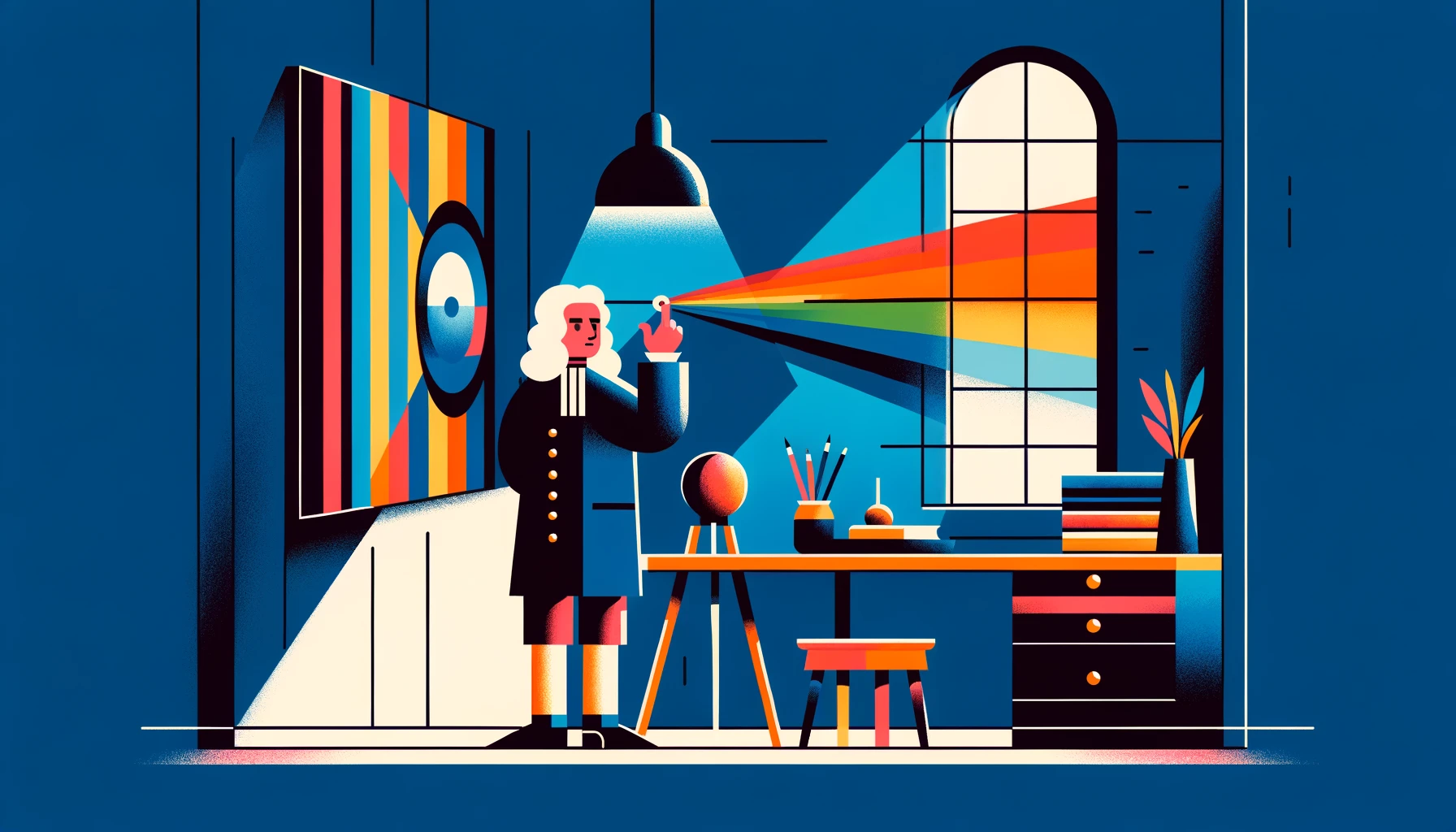
Era of Enlightenment: The Color Wheel Revolution
In 1666, Isaac Newton observes light refract through a prism, merges the spectrum into a circle, and pairs the colors opposite each other. This creates the first color wheel, the concept of complementary colors, and the field of color theory is discovered.
Over the centuries, Newton's theory faced many challenges from figures like Johann Wolfgang von Goethe and Wilhelm Ostwald, each grounded in their own unique perspectives. Goethe's approach focused on the emotional and artistic perception of colors, while Ostwald pressed on with a focus on their physical properties.
Munsell: Harmonizing with a 3D Color Globe
Albert Munsell further challenges the color wheel with a 3D model in the early 20th century. His color sphere integrates hue, value, and chroma as values to measure color. The colors are adjusted proportionally, providing a more nuanced and usable system for understanding and organizing colors.
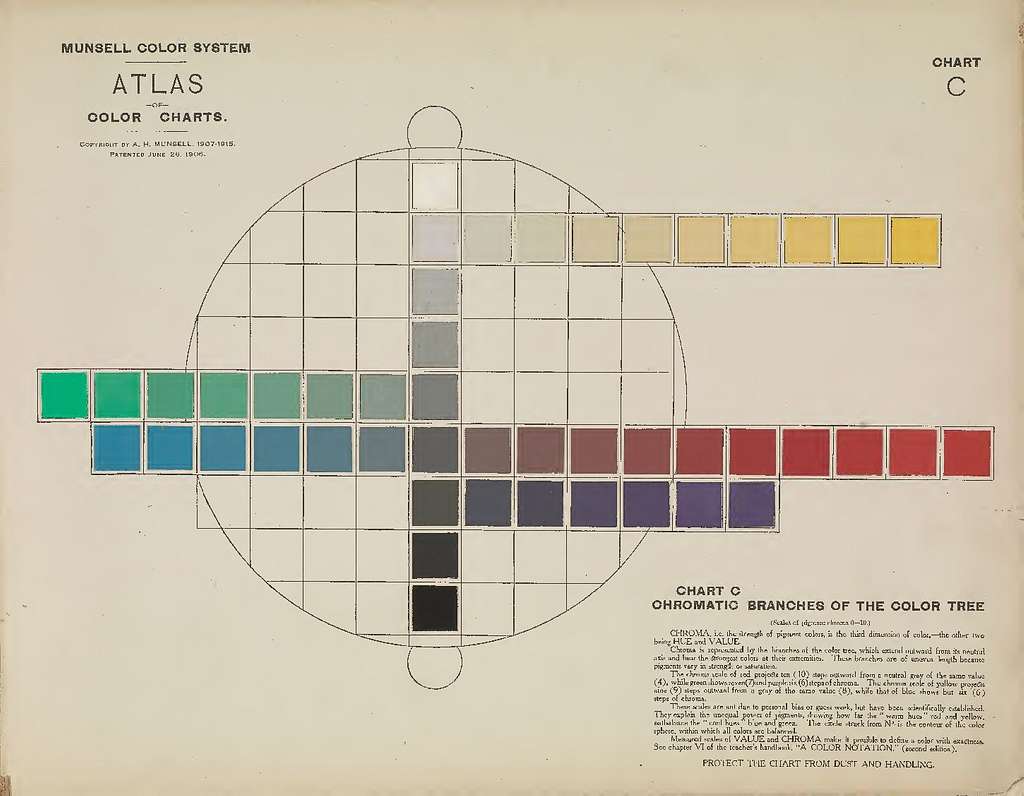
If you've worked with HSL and HSV, this might look familiar. While the formats may borrow some of the concept, they are not the Munsell color system.
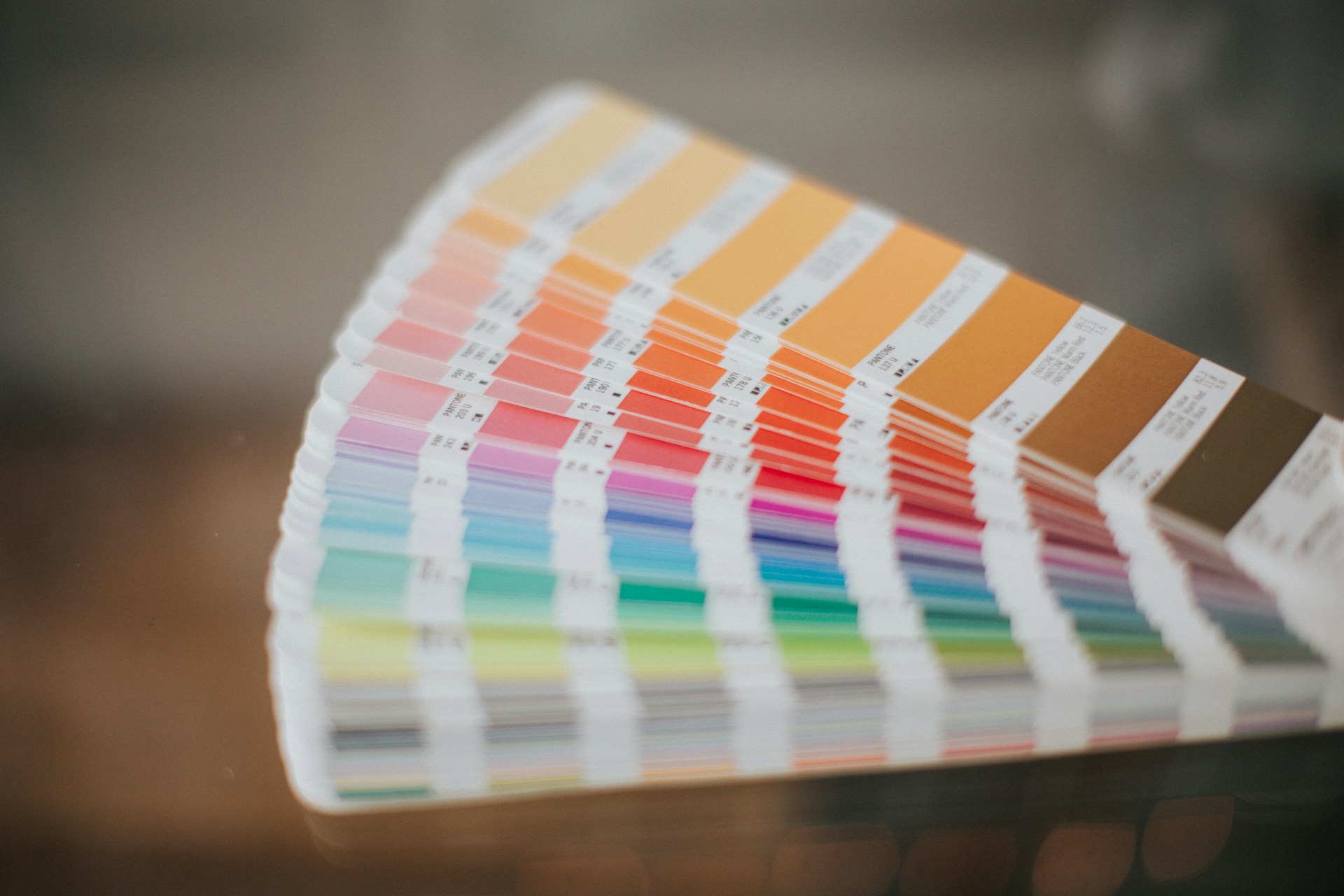
Pantone Color Matching System: Standardizing Color
Pantone arrives in 1960s to systematize color reproduction across industries, print materials, screens, and more.
Thanks to them, a red is not just red; it's Fire Engine Red or Red Maple. They ensure your Coca-Cola red isn't looking like the Pepsi red.
RGB and CMYK Come to Rule the Digital World
The 20th century takes another sharp turn with the advent of computing. RGB (Red, Green, Blue) is made for screens and CMYK (Cyan, Magenta, Yellow, and Black) for printing. While not intended for color harmony, they're essential for digital design.
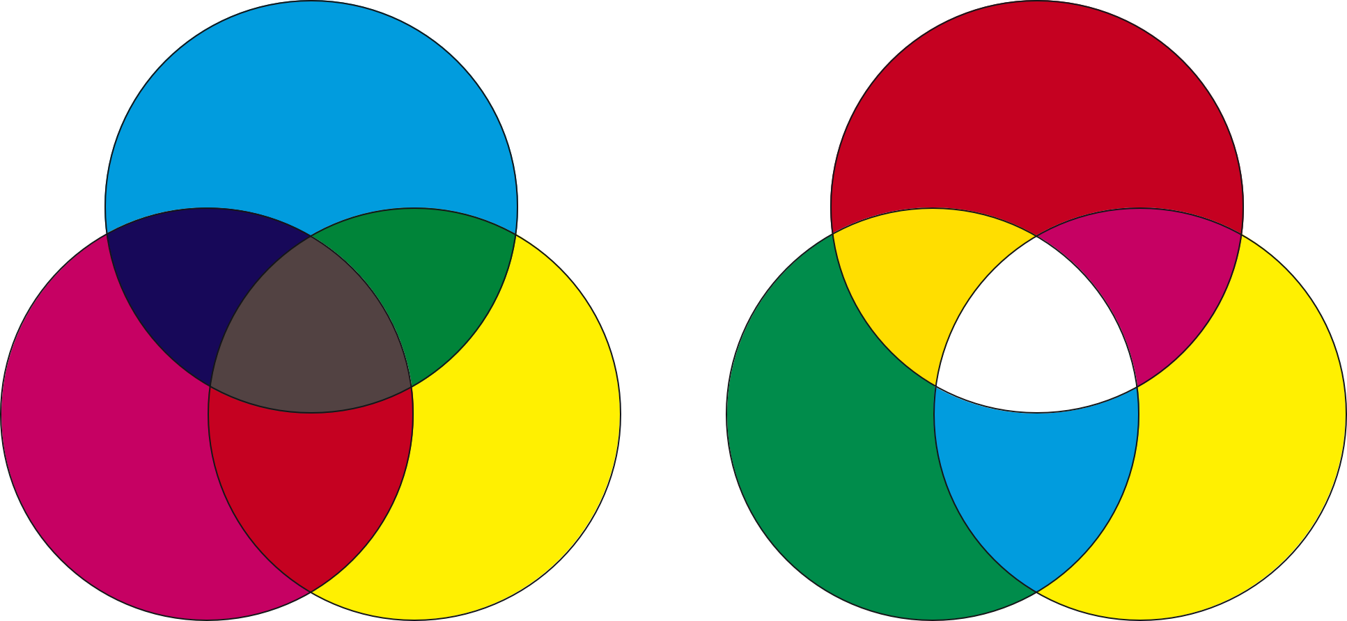
A simplistic way to understand the difference between them is, RGB is trying to light up a dark monitor panel, while CMYK is trying to paint over a white piece of paper.
When you combine red, green, and blue light at their full intensity, they produce white light. Meanwhile, paper absorbs various inks to produce the desired color. Given these differences, matching colors between print and digital is very difficult.
Other digital formats, such as HSL (Hue, Saturation, Lightness) and HSV (Hue, Saturation, Value) were introduced to make interacting with color more intuitive, but they are simply building over these concepts, and we'll go into that later.
CIE XYZ: Bridging the Human and Digital Color Spectrum
Fast-forward to the glorious 70s, CIE XYZ is developed by the International Commission on Illumination (CIE). With a focus on how human perceive color and digital representation, it paves the way for modern color management systems.
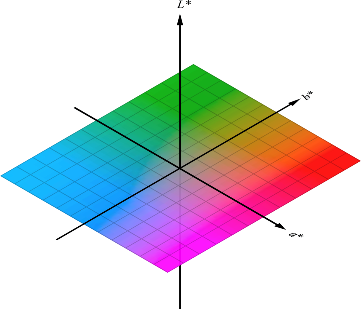
CIE XYZ forms the foundation for various perceptual color spaces, such as LAB and HCL. They may seem unfamiliar, but many apps use them behind the scenes. Much of Color Schemer and this course is focused around showing you how to use them.
Conclusion: Art Meets Science
After hundreds, and perhaps thousands of years, humanity is slowly starting to agree on what 'red' really looks like. Working with color today is easier than ever. And as we push forward into the digital age, we continue to uncover new ways to understand and apply color in design.
 Table of Contents